
How Consumer Psychology Informs AI Product Design
The IKEA Effect, the Paradox of Choice, and AI's Interface Problem

Weekly writing about how technology and people intersect. By day, I’m building Daybreak to partner with early-stage founders. By night, I’m writing Digital Native about market trends and startup opportunities.
If you haven’t subscribed, join 65,000+ weekly readers by subscribing here:
Hey Everyone 👋,
This week marks five years (!) of Digital Native. It’s been a fun five years:
~250 long-form essays about how people and technology intersect
~850,000 words (about 10 full-length books!)
~67,500 subscribers
We’ve grown the community pretty consistently over the years—here’s a chart of subscriber growth, which starts when we ported over to Substack from Mailchimp in April 2020. No big jumps, just consistent compounding week-over-week. Thank you to all of you who have told friends, family, and coworkers about Digital Native! 🙏

Thanks for being along for the ride! Here’s to another five years.
How Consumer Psychology Informs AI Product Design
Last year in The Egg Theory of AI, we wrote about a famous example of consumer psychology.
When instant cake mixes came out, they sold poorly. Making a cake was too quick and easy. People felt guilty about not contributing to the baking. So companies started requiring you to add an egg, which made people feel like they contributed. Sales soared.

We extended this principle to AI product design: the basic argument was that most AI products shouldn’t complete remove the human from the loop; people like control, or at least the semblance of control.
AI is unfamiliar technology, and we’re still wrapping our heads around its capabilities and use cases. Technology changes—fast; people don’t change very much. In order to adapt to new technologies—especially when things are changing faster than ever—we should rely on old principles of human behavior.

I’ve been thinking a lot about AI product design, as many products seem to be missing the mark. For this week’s Digital Native, I want to look at a few more principles of user psychology and apply to them to AI. We’ll start with a quick backdrop on AI’s user interface problem, then tackle five phenomena:
The IKEA Effect
The Paradox of Choice
The Bandwagon Effect
The Endowment Effect
The Foot-in-the-Door Technique
Let’s dive in 👇
Backdrop: AI Has an Interface Problem
The inspiration for this piece was realizing that AI has gotten…pretty confusing. Check this out:

Yikes. Why should the user—an everyday person, probably non-technical—have to choose from eight model options, each with esoteric and confusing names? It’s a total nightmare.
To his credit, Sam Altman is aware of the issue; he tweeted about it last week:

But this is becoming a major issue. We wrote last week about the growing AI backlash. When users are already skeptical of adopting a new technology, your interface better be top notch. We need AI products that are elegant, simple, and intuitive—products that give people comfort and peace of mind, packaging powerful new capabilities in a familiar, approachable package.
On 20VC, Suno founder Mikey Shulman talked about his early resistance to moving Suno off of Discord. But when Suno launched a web app, it took only five days for 90% of its traffic to move to web. Not shocking for anyone who has tried to use Discord. Anecdotally, I had a similar experience with Midjourney: my usage rose dramatically when Midjourney expanded beyond Discord.
Interface matters, and AI has a major UI problem right now.
The IKEA Effect
The IKEA Effect is related to the egg theory. The basic idea is that people value things more highly if they’ve had a hand in creating them, even if the effort is minimal.

I would draw a distinction from the egg theory. The core of the egg theory is that when a product or process is too easy, people don’t feel a sense of contribution or accomplishment. The IKEA effect, though, focuses on the value people place on things they’ve had a hand in creating.
For me, when it comes to AI product design, this means personalization. We all like things that we help mold—including our copilots and agents and chatbots. More tools should be customized with personal preferences and styles, rather than monolithic feature sets. Maybe an email agent lets me customize it before I let it run loose in my inbox. And so on.
The Paradox of Choice
Too many choices leads to anxiety, paralysis, and dissatisfaction.
The famous study here dates back to 2000. Researchers conducted the study in a supermarket, where they set up two different displays of jam: one with 6 options and the other with 24 options. Although the larger selection of jams attracted more attention, only 3% of customers who saw that selection ended up buying a jar. Meanwhile, 30% of customers who saw the smaller selection made a purchase.

This shouldn’t be surprising to anyone who’s been to supermarket—or to a Cheesecake Factory.
Yet AI products just aren’t getting this right. MG Siegler points to Gemini’s UI, shown here—a total mess:

This is the model picker drop-down. So confusing. And don’t even get me started on the names. “Hey babe, would you mind looking that up?” “Sure thing, honey, let me use ‘2.0 Flash Thinking Experimental with apps’!” At least Gemini is a good name, though as MG points out, Google doesn’t own Gemini.com (the crypto company does).
What about a product that—gasp!—picks the appropriate model for you. Wild. The less the user is involved in the messy inner-workings of AI, the better. We don’t want too many choices—we just want the product to accomplish our “job to be done.”
I’ve always felt Midjourney does this well—you get one prompt (“What will you imagine?”), one image model, four output options. You can upscale or remix each image, but that’s about it. Pretty straightforward.

Another product that does this well: Granola. Granola may be my most-used and most-beloved AI tool. If you don’t use it already, you’re welcome—your life is about to change. Granola summarizes your meetings, and is elegant in its simplicity; the interface is clean and straightforward, and there are only a few key things you’re asked to do post-meeting:
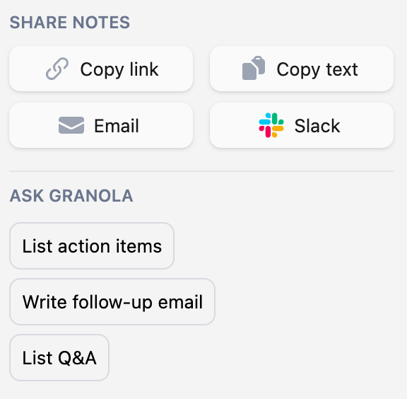
So simple 😌.
When faced with too many choices, users often feel less in control. AI is already overwhelming in its pace of adoption and ever-expanding capabilities. Well-designed products should calm us down and package AI in something digestible and comfortable.
The Bandwagon Effect
The Bandwagon Effect is pretty straightforward: its the psychological phenomenon that people tend to adopt behaviors, beliefs, or attitudes because they perceive others are doing the same. Think: TikTok dances, skinny jeans, or the ALS Ice Bucket Challenge (#tbt). In startup world, the bandwagon effect often means (1) viral growth, and (2) network effects.
So it’s surprising that many AI tools aren’t social. Instead, users are siloed, forced to explore new products alone without social proofing or cues. ChatGPT has been slow to adopt network features—it would be helpful to see what people I know have searched for. There’s a robust subculture on TikTok of people sharing perfectly-crafted ChatGPT prompts (e.g., “Design a 3-month calendar for me to achieve the following goals…”)—so why isn’t there a way to share and showcase these better? Network features would also add in defensibility against challengers like DeepSeek.
Image models can also improve here. Midjourney’s Explore (formerly Showcase) is nice—I enjoy perusing trending creations—but I want to see what my own contacts have created.

AI seems to be in its single-player era. I expect we see more networks form, and products should get more social and collaborative over time.
The Endowment Effect
The landmark study for the Endowment Effect came in 1990. Psychologists Kahneman, Knetsch, and Thaler randomly gave participants either a mug or a pen. Participants were then asked to either sell or trade their item for the other item. Naturally, people who were given the mug valued it significantly higher than people who weren’t given the mug. Same story for the pen.

When I think of the endowment effect, I again think of personalization. Personalization is when we make stuff ours, we start to value it more.
To return to the example of the email agent from earlier: it’s harder to give up my agent when it learns my email style over time. If Granola, meanwhile, improved over time based on my feedback—how I like to take notes, which takeaways are important to me—the product also becomes harder to give up. And same for a NSFW chatbot—if I build a romantic relationship with shared history, that’s tough to say goodbye to. (Good read: Harpers Bazaar’s How I Learned to Stop Worrying and Love the Bot.) Good design should make it clear that the product is customized to you.
The Foot-in-the-Door Technique
The Foot-in-the-Door Technique dates back to a 1966 study. The researchers, Freedman and Fraser, wanted to test how people would respond to a request after they’d already agreed to a smaller, related request.
First, researchers asked homeowners to put a small, discreet sign in their yard that read “Drive Carefully.” The sign was unobtrusive, easy to agree to. Then, two weeks later, the same homeowners were asked to place a much larger and more intrusive billboard in their yard. Naturally, those who had agreed to the first sign were more likely to put up the billboard.
Foot-in-the-door is used widely—we see campaigns ask for something small (signing a petition, for instance) before making a bigger ask (a donation, volunteering). Or take business models: it’s commonplace for subscription companies to offer free trials.
When it comes to AI, we also see freemium models. Most of the leading AI products employ the tactic today; this “try before you buy” helps get people hooked on AI.

But we also need the products themselves to gently nudge users toward new, sometimes uncomfortable behaviors.
A legal AI tool, for instance, might be capable of automating a huge swath of a paralegal’s work. But that automation, though possible, may not be advisable: stodgy law firms aren’t exactly eager to change the way things have been done for decades. A good product might start small: help the paralegal review contracts quickly. Contract review is one of the most repetitive and draining tasks a paralegal will have. Only once the user has used the product for something small, like contract review, should the product nudge the user towards more powerful capabilities—say, drafting discovery documents.
Final Thoughts: Complexity Creep
AI is too complex right now. Part of the reason is that products are showing off the bells and whistles—it’s tempting for product teams to flex the full range and power of what’s possible. But restraint is a good thing.
One of the years-long trends we’ve seen in tech is the blurring lines between consumer and enterprise. My friend Nikhil recently had some good visuals to show this. Check out how many top technology companies are both consumer and enterprise companies:

Same story for AI, with products like Cursor, ElevenLabs, Elicit, GPTZero, Granola, HeyGen, Midjourney, Perplexity, Runway, and Suno having consumer and bottoms-up enterprise adoption.

Yet when it comes to product design, many products are feeling very enterprise-y when they should be running a consumer playbook.
People are pretty simple; we have many case studies of how they like to behave. The principles above are good reminders of the things that haven’t changed: people want straightforward products that reduce choice, clearly state capabilities, and nudge users toward intended actions.
Related Digital Native Pieces
Thanks for reading! Subscribe here to receive Digital Native in your inbox each week: