
In the Costco Era of Software, Design Is the Differentiator
When the Tech Is Commoditized, "Taste" Is Everything

Weekly writing about how technology and people intersect. By day, I’m building Daybreak to partner with early-stage founders. By night, I’m writing Digital Native about market trends and startup opportunities.
If you haven’t subscribed, join 70,000+ weekly readers by subscribing here:
In the Costco Era of Software, Design Is the Differentiator
We’re in what I’ve been calling the “Costco era” of software: mass-produced, vibe-coded software that’s gobbling up most of the world’s code. Buy it in bulk, consume it in bulk.
Some quick stats:
In April, Satya Nadella said that 30% of Microsoft code is now written with AI.
GitHub Copilot now writes ~40% of the code in projects where it’s used.
Anthropic’s Mike Krieger said recently that 90% of Claude’s code is now written by AI (very meta).
Lovable, in announcing its $200M Series A this summer, reported 2.3M active users. I’d be curious to know what portion of those 2.3M are software engineers. How many can write code? I’d wager the portion is under 50%. (We covered Lovable a bit in June’s The Personalization of Software. You can still find my Meal Tracker app here, which was built in under 30 seconds.)
As the cost of software creation approaches zero, how will products stand out? I like how Figma’s Dylan Field recently put it on Twitter: design is the differentiator.
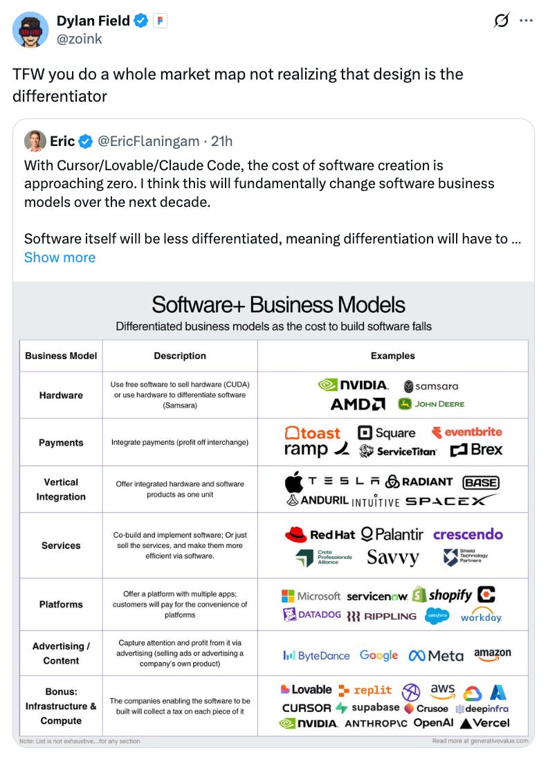
Dylan was responding to my friend Eric’s excellent piece, which focused on business model differentiation in an age of software abundance. Eric made good arguments, but Dylan also had a point: with more stuff being made, we need to make sure stuff looks good. People aren’t too complicated: they want to use products that are beautiful and elegant and delightful. When more products exist because making them is easier, design principles become even more important in discerning quality from AI slop.
Here’s an example of why product design matters:
I saw the below tweet last week about Epic launching a medical scribe. I thought it was satire. Epic does over $5B in revenue, employs 14,000 people, and touches 305M patients with its platform. Yet this is what it comes up with?
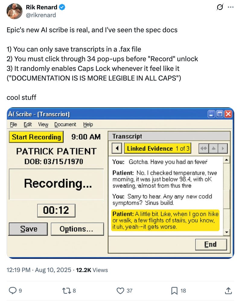
I haven’t been able to find much on Epic’s foray into scribes (though the company just announced a partnership with Microsoft), but it’s safe to say that the design will be lacking.
Compare Epic to Abridge, which has been deeply integrated with Epic (they began partnering in 2023) but which was founded 39 years later. Here’s Abridge’s product:

You can see the Epic partnership here in the screenshot, but Abridge has built a beautiful and intuitive product. It rocks, and doctors love it.
Yet Epic has 42% of the hospital market on its platform, which gives it tremendous leverage as it delves deeper into AI. Rumors are Epic will price its scribe at $80 per provider per month, much cheaper than most AI scribes (Epic can wield its balance sheet as a weapon, underpricing competitors to take market share).
But the good news for startups: many physicians have agency over which scribe they choose. This means that good design and user experience can still win out. Which will have better product design, the lethargic incumbent or the AI-native upstart staffed with some of the best product / eng / design talent in Silicon Valley? I know where I’d bet my money.
Side note: one thing Epic will always win in—having the coolest corporate campus. Epic’s sprawling 1,700-acre campus in Wisconsin has 28 buildings, each with a unique theme. Here’s the Oz building:

And here’s the chocolate factory:

I digress. The point is: good design has always been an advantage for startups, but it’s even more of an edge in the age of vibe coding and a digital Cambrian explosion.
What companies will benefit here? Well, Figma for one. Design is, indeed, becoming everyone’s business. Figma now sports a $34B market cap to show for it.

But we’ll also see new AI-native products help us make beautiful things. One of our Daybreak portfolio companies, Montra, is launching this week. Montra is building an AI-powered video creation platform that lets you generate, edit, and polish professional videos. Here’s Campbell, Montra’s co-founder and CEO, in the launch video:
You can check out the product here. Montra is one example of a new generation of companies that turbocharge creativity and make design more accessible. Figma began with the mission “close the gap between imagination and reality” and continues to execute on it; it’s just now joined by AI-native companies letting us manipulate code and content in creative, expressive ways. It’s only going to become easier to play with software, shaping it and molding it like Play-Doh into your desired product.
Another analogy I think about with the Costco era of code is what has happened in content. Just as software creation is exploding (and has been), content creation is exploding (and has been). Both have products in “bulk,” with mass availability and low costs to entry. In both code and content, it’s becoming tough to discern quality from quantity, signal from noise.
As we’ve gotten more and more content, we’ve relied on a few markers for quality. The obvious one is IP: we’re more likely to check out a movie if it comes from Pixar, from Star Wars, from Marvel. (Well done, Disney, on those three acquisitions.) The proxy in software is name-brand company: I’m more likely to try out new software if it comes from Figma, for instance.
But another marker of quality in content, as in software, is design. Being distinct and memorable helps you stand out in an ocean of mediocre, mass-produced “stuff.” The example I often think of here is Spiderverse. Yes, the Sony animation flicks benefited from IP—but they’re also incredibly refreshing in their animation style, which is gorgeous and unusual.

What’s the Spiderverse analogue for early-stage startups? How do you inject style and character and panache into your product, so that you stand out from the herd?
Last year’s The Design of Everyday Things dove into some of the design principles that stand the test of time. That Digital Native piece was named for Don Norman’s book of the same name. The famous example from Norman’s book is the design of a door. From last year’s piece:
We’ve all encountered a bad door. We push, then realize it’s a “pull” door. Or we yank, only to realize we should instead be pushing. The takeaway from Norman: it’s never our fault. Poor design is never the user’s fault, but the designer’s. So it’s not your fault that you pulled that door instead of pushing.
Good door design means the user—you—should easily know what action to take. When doors have to label themselves “PUSH” or “PULL,” they’ve already failed. Good design uses subtle cues to signal to the user the intended action. In the image below, the door on the right probably doesn’t need the “PULL” label; the handles suggest that action. The door on the left…well, the door on the left is an unmitigated disaster.

There are a few principles that will always matter in design: clarity of purpose, user-centered design, simplicity. Taking the door example:
Clarity of purpose: A door should make its purpose obvious at a glance: do I push, pull, or slide? A well-designed door communicates this without a label. Examples:
A flat metal plate on one side signals “push.”
A handle that your fingers can curl around says “pull.”
A recessed groove or track suggests “slide.”
User-centered design: Designers might wish that we took our time with doors, that we admired them and inspected them and moved slowly. But that’s not true, and it’s not user-centric design. People often approach a door quickly, often distracted, carrying things, or in a hurry.
Good design should align with this truth: the door should be wide enough, easy to operate with one hand, and so on.
Simplicity: Good design removes complexity. If a door has identical handles on both sides, I always think of it as poor design (and I always don’t know whether to push or pull).
A good example of simple design is an emergency exit door, with a big red push bar. Simple, straightforward, low cognitive load.
I keep revisiting the importance of design as we see more AI applications, many built with AI code.
Good design doesn’t mean shoving every bell and whistle into a product. (This is one way I see many startups struggle, particularly in vertical AI: skeptical lawyers and construction workers and restauranteurs don’t want a product overloaded with state-of-the-art features from the latest model; they want a simple, intuitive product that gets the job done).
When the underlying tech gets commoditized, in this case software creation, we’re forced to rely on taste, which is much harder to automate. Or, as Dylan put it, design is the differentiator.
Thanks for reading! Subscribe here to receive Digital Native in your inbox each week: