Weekly writing about how technology and people intersect. By day, I’m building Daybreak to partner with early-stage founders. By night, I’m writing Digital Native about market trends and startup opportunities.
If you haven’t subscribed, join 60,000+ weekly readers by subscribing here:
The Design of Everyday Things
We’ve all encountered a bad door. We push, then realize it’s a “pull” door. Or we yank, only to realize we should instead be pushing. Oops. Inevitably, we feel stupid.
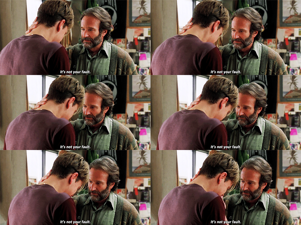
What we should keep in mind is this: it’s never our fault.
One of my favorite books about product design is a 1998 book called The Design of Everyday Things, by Don Norman. And a key takeaway from the book is: poor design is never the user’s fault, but the designer’s.
Let’s repeat that: poor design is never the user’s fault, but the designer’s.
So it’s not your fault that you pulled that door instead of pushing. Good door design means the user—you—should easily know what action to take. When doors have to label themselves “PUSH” or “PULL,” they’ve already failed. Good design uses subtle cues to signal to the user the intended action. In the image below, the door on the right probably doesn’t need the “PULL” label; the handles suggest that action. The door on the left…well, the door on the left is an unmitigated disaster.
A good “push” door should direct us toward the proper action with good design. I love myself a door with a good push bar like this one:
😮💨.
Bad doors have become known as Norman doors, named after Don Norman, the author and design legend mentioned earlier. A Norman door is basically any door that’s confusing or difficult to use—a door whose design elements give the wrong usability signals, to the point where a label is typically needed.
Lately, I’ve been thinking a lot about Norman doors and The Design of Everyday Things, particularly when it comes to AI products.
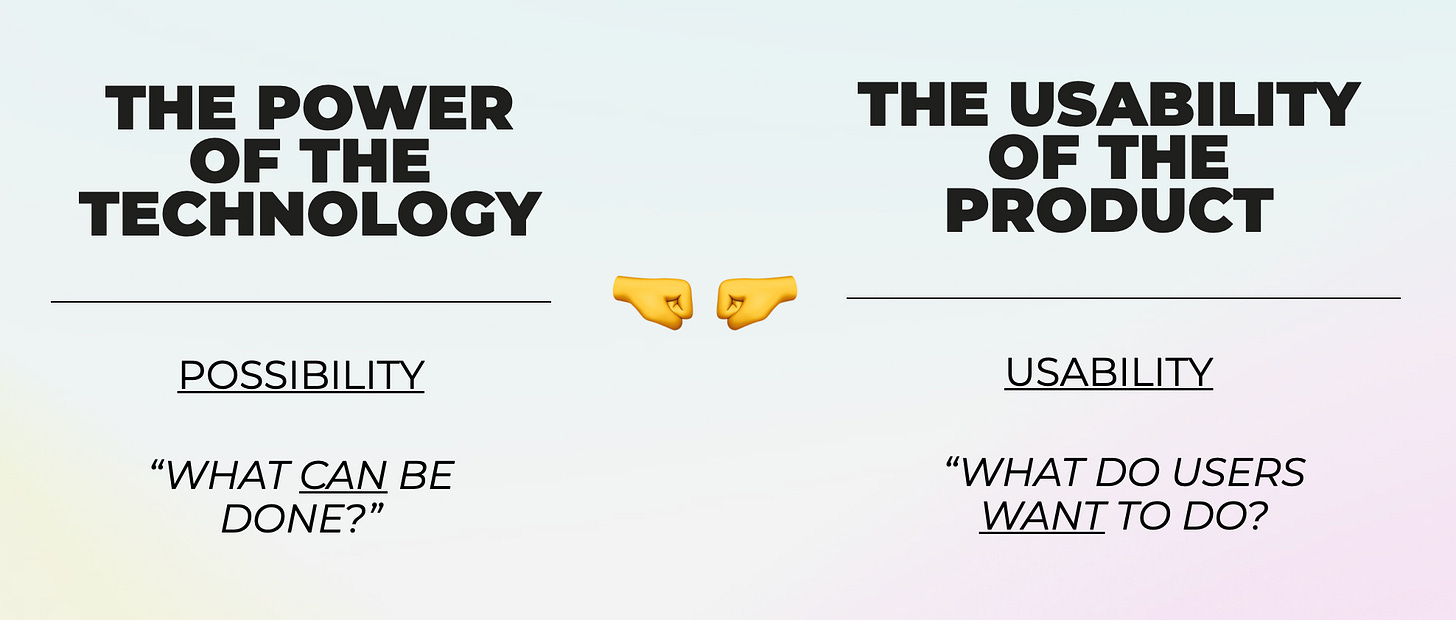
We’ve reached a point at which AI products are so powerful, yet so novel to their users, that we often forgo usability in favor of possibility. What do I mean by that? Many product builders are focused on what can we do—what are the new possibilities opened up by this technology? But we forget design principles that make products approachable and intuitive to users. Good products don’t jam in all the bells and whistles; they don’t show off. Good products focus on a key “job to be done” (or several at most) and communicate those functionalities in an elegant way.
As AI grows more powerful and multi-faceted, this will become a bigger problem. More powerful technology means greater tension with simple and intuitive product design:
Product builders will need to remain disciplined and laser-focused on design as they tackle AI products.
As I thought through this topic in recent weeks, I realized I wanted to revisit The Design of Everyday Things. But I didn’t really want to re-read the book. So I thought I’d refresh my knowledge by testing out a new AI product.
Google has been making headlines for its new NotebookLM product. NotebookLM lets you upload documents—say, your class notes—and convert them into easy-to-understand study material.
Here’s what the landing page looks like, outlining the main steps:
Notebook has gone viral on TikTok mainly for turning notes into an engaging podcast. The product is truly stunning. In one example TikTok, a law student uploads her notes to NotepadLM; then Notepad spits out a 20-minute podcast with two human-sounding voices bantering about tort law.
I decided to use Notepad for my own briefing on The Design of Everyday Things. I found an online PDF of the book and uploaded it to Notepad. Then I clicked a button to generate an audio overview. Here’s what the screen ended up looking like:
You can see that Notebook identified the text, summarized it, and suggested study questions. But most incredibly, Notebook produced a 12-minute podcast about the book. I’m able to make this podcast link public, and I’m sharing it here:
Listen to at least a few seconds of it.
As you can hear, the AI-generated podcast sounds very, very real. We have a female voice and a male voice go back and forth about the main topics of the book. They have mastery over the book’s contents, yes, but even more impressively, they have real chemistry—they sound like two podcast hosts who have been doing a show together for a long time. Yet they’re AI personas, mimicking podcast hosts. Insane.
Clearly, I wish I had this in college. Listening to a fun podcast about economics or government sounds more fun than re-reading your lecture notes or a dull textbook. It’s also a lot more efficient—if you don’t want to read the Don Norman book, just listen to the 12-minute podcast linked above. You’ll get the gist.
On TikTok, people have been similarly floored by Notebook:
Google chimed in, proud of its creation:
And, naturally, people began to think up other use cases:
Notebook is a well-designed product. It flexes the power of modern AI models, yet packages everything in an easy-to-use interface.
ChatGPT is also a well-designed product. Check out this screenshot of the ChatGPT homepage:
In The Design of Everyday Things, Norman writes about two important characteristics of good design:
Discoverability: Can users figure out what possible actions they can take with your product?
Understandability: Can users easily figure out how the product should be used?
ChatGPT nails both.
The search bar, cursor, and text “Message ChatGPT” tell us that we should type a prompt. This borrows from Google, which familiarized a similar design. Meanwhile, the suggested use cases that hover above the search bar solve another problem: talking to an AI chatbot is new to us, and we’re not exactly sure what the product should be used for. This is the Discoverability. Those subtle nudges towards possible use cases help us out.
I’ve written in the past about one of our Daybreak companies that’s building an AI personal stylist. I can chat with the stylist about the clothes I want to buy. This is also a new behavior: we’re used to shopping by typing in “men’s white pants,” not by typing, “Hey I’m going to the South of France and I want colorful pastels that are breathable and make me look like a star in The White Lotus.” We can solve this problem with good product design, signaling to the user example searches. You can imagine a search bar with sample prompts floating nearby, or trending user searches displayed prominently.
Earlier this week, we made an investment in a B2B company that’s building AI tools for lawyers. The same concepts extend here. An attorney is used to combing through PDFs, ctrl + F’ing for certain terms. Yet today, AI can ingest that PDF and draw out insights and key information. This is new for the attorney, and the AI product requires good product design to communicate to the attorney its potential use cases. Otherwise, the attorney will be stuck staring at their screen, unsure how to leverage LLMs to their advantage. A few B2B AI startups I’ve encountered nail this; most don’t. Enterprise LLM functionality is getting pretty sophisticated, and that comes at the expense of intuitive design.
One good rule of thumb for product design: if a product has to come with a manual, it’s probably failing on both Discoverability and Understandability.
Great founders are often (1) deeply technical, (2) possessing deep domain expertise in an area, or (3) both. These are traps for good design. Most users of a product don’t have the same level of technical prowess or industry knowledge as that product’s founder—so if a founder builds a product for herself, she may be going over the heads of her average user. The surefire path around this: talk to your customers—a lot—and keep things as simple as possible while achieving the intended “job to be done.”
Final Thoughts
You might remember back in 2018 when Hawaii accidentally sent a missile alert to the phones of millions of Hawaiians, setting off a panic.
Thirty-eight minutes later, the government clarified that they’d only been meaning to test the alert system, not to actually set it off. Oopsie!
Researchers later found that the error stemmed from poor design. The computer system that the Hawaiian Emergency Management Agency (HEMA) used to send alerts was designed in a way that workers were given a drop-down option with two options:
“Test missile alert”
“Missile alert”
The first option would test the notification system without actually sending an alert to the public. The second option would immediately warn every Hawaiian cell phone user to “SEEK IMMEDIATE SHELTER,” specifically noting “THIS IS NOT A DRILL.” Only one four-letter word separated the two options, which were right next to each other.
When it comes to user error, design is often at fault.
I’ve always been obsessed with design—and once you start looking, you’ll see bad design everywhere. You’ll see it in your washing machine dials, you’ll see it in ATM machines, you’ll see it in the ridiculous Aesop soap and lotion bottles that look exactly alike and ensure that any time you go to wash your hands in a nice restaurant or office you go to put soap on your hands and end up with lotion that you have to wash down the sink.
Anyway. As technology becomes more complex, design needs to become more simple.
AI can do a lot now, much of it new to us, and we need products that follow design principles to ensure we don’t feel stupid using them. Next time you find yourself pulling a “push” door, remember: it’s not your fault. And next time you find yourself confused by how to use a new AI tool, also remember: it’s not your fault.
Sources & Additional Reading
Check out Don Norman’s 1998 book, The Design of Everyday Things — it’s a classic that stands the test of time
And check out NotepadLM’s 12-minute podcast summary here :)
Thanks for reading! Subscribe here to receive Digital Native in your inbox each week:


