
The Interior Design of Software
How Design Evolves in a Post-AI World

Weekly writing about how technology and people intersect. By day, I’m building Daybreak to partner with early-stage founders. By night, I’m writing Digital Native about market trends and startup opportunities.
If you haven’t subscribed, join 70,000+ weekly readers by subscribing here:
The Interior Design of Software
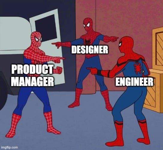
Back in January, Marc Andreessen talked about the “Mexican standoff” happening between product managers, designers, and coders. From his conversation with Lenny Rachitsky:
“Every coder now believes they can also be a product manager and a designer, because they have AI. Every product manager thinks they can be a coder and a designer. And every designer knows they can be a product manager and a coder.
People in each of those roles now know or believe that with AI, they don’t need the other two roles anymore.”
I don’t know if Andreessen used the classic Spider Man meme or if someone else did, but every time I think of this quote I think of the meme:
I’ve been thinking specifically about the future of design in a world of infinite software. That’s the focus of this week’s piece. And spoiler alert: design is becoming (a lot) more important! Design may be the most important skill of the three; last month’s New Yorker piece titled “Why Tech Bros Are Now Obsessed With Taste” was, unfortunately, spot on. Taste matters more than ever. We can see the centrality of design in Andreessen’s use of the word “knows.” Putting the key words here in bold and italics:
“Every coder now believes they can also be a product manager and a designer, because they have AI. Every product manager thinks they can be a coder and a designer. And every designer knows they can be a product manager and a coder.”
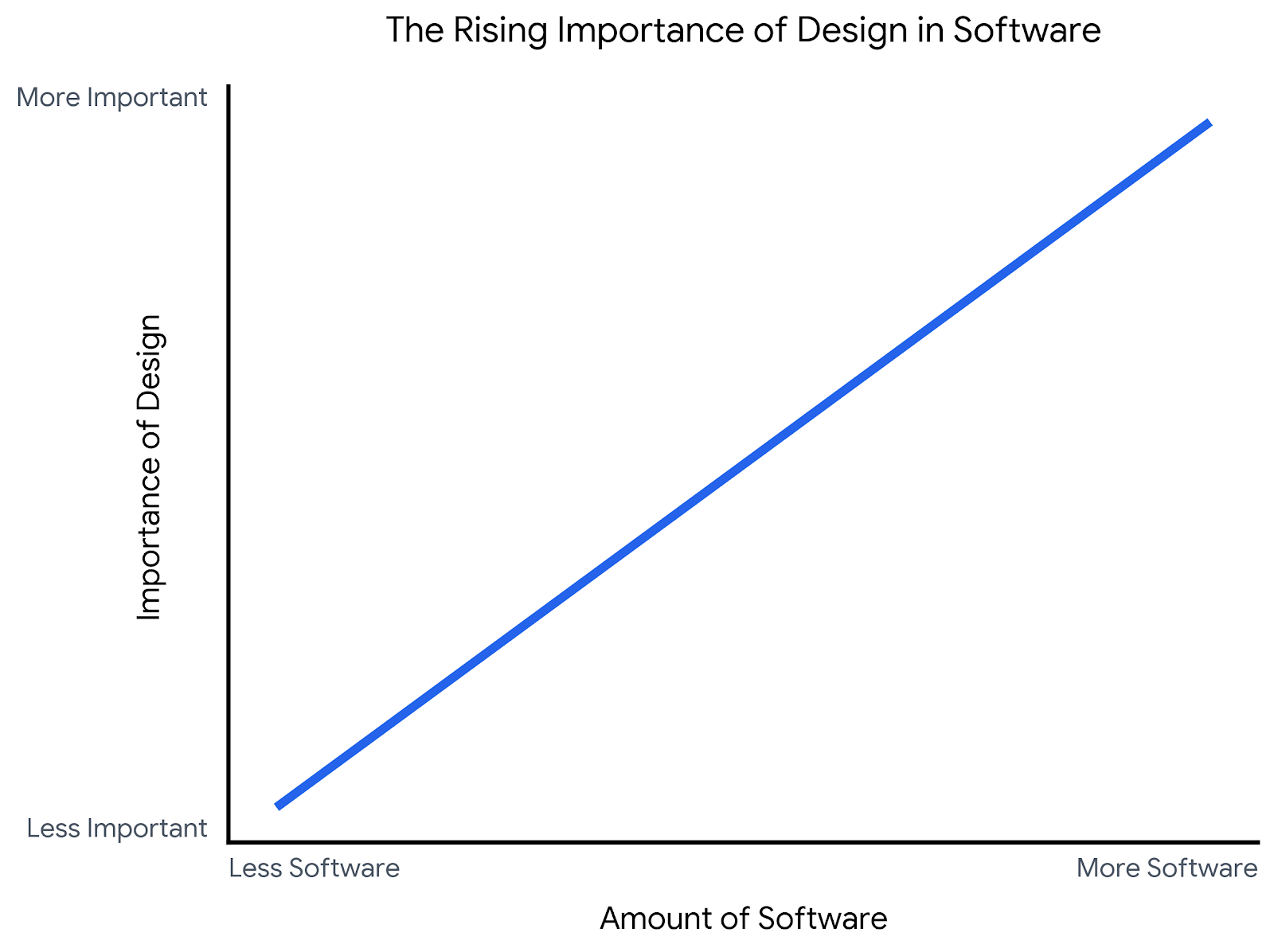
As the amount of software increases, so does the importance of design. The crude chart looks something like this:
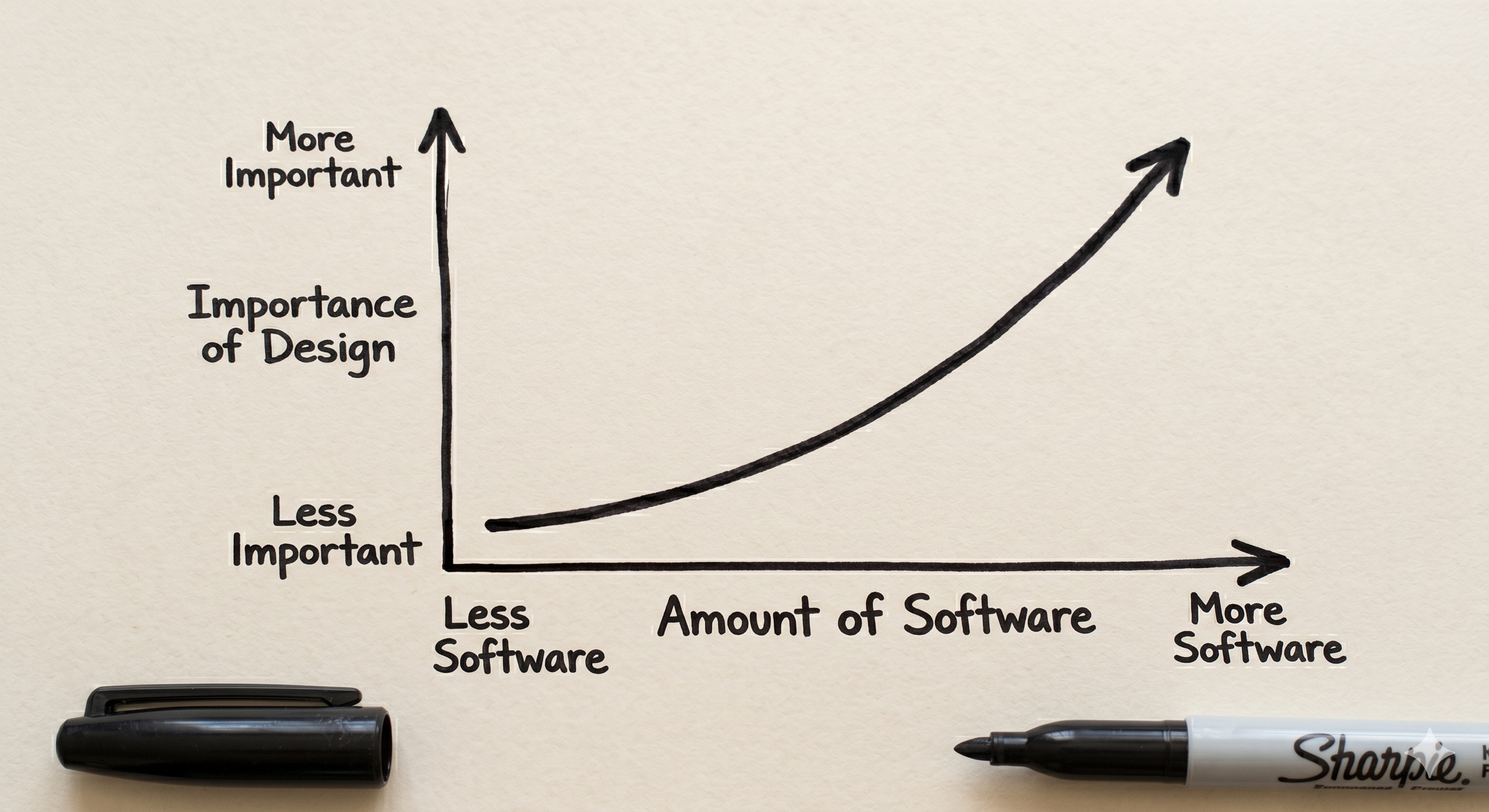
Thankfully, as software becomes easier to make, design also becomes easier. Case in point: I made the chart above in ~10 seconds from a quick prompt in Gemini. But good design still requires an element of taste (yup, there I go), which means an iteration or two of good prompting. The image below was Gemini’s first version of the chart, which I found lacking, so I added a prompt to refine it:
Software is becoming more like culture and less like infrastructure. Software’s origins are utilitarian, tool-like, a means to an end. Infrastructure rewards standardization, and the most recent generation of design has been all about conforming.
But as software becomes more infinitely produceable, it begins to behave more like culture, which rewards specificity, voice, and a point of view. This means the bottleneck shifts from engineering to editorial judgment, knowing what to build and what a product should feel like. We haven’t had much innovation in design since iOS 7 flattened everything in 2013 (more on that in a minute), and it feels like we’re finally on the cusp of a new era: more opinionated design.
The Progression of Design
Design has historically been shaped and constrained by the technologies of the time. Early software lacked personality because screen real estate was precious and bandwidth was limited. A mid-80s Macintosh had a 512x342 black-and-white display and 128 KB of RAM, while a website in 1996 found itself constrained by a 640x480 monitor and a 28.8K modem that took 30 seconds to load a single color image. As a result, design largely meant keeping things legible.
The earliest era of software had no graphics at all. Here’s an image of VisiCalc, the first spreadsheet computer program, built by VisiCorp for the Apple II in 1979. It was considered the killer application for Apple II, when Apple—still called Apple Computers—was just three years old. (Apple wouldn’t change its name until January 2007, the same day as the iPhone launch, formally closing the PC-centric era.)

Applications like VisiCalc didn’t really have design, per se, or at least they didn’t have design beyond basic typography and keyboard shortcuts. These apps were utilities.
The first graphical user interfaces began to push against constraints. A graphic designer at Apple, Susan Kare, designed the original Macintosh icons in the mid-80s. We got the dog-eared document, the trash can, the floppy disk. These were immediately iconic (pun very much intended).
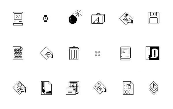
Kare’s designs still persist today, in everything from the command key ⌘ to the paintbrush icons used on any visual design site. (This 99% Invisible piece offers a good overview of Kare’s work.) In the 80s, design remained monochrome, squeezed into a small number of pixels, but design was starting to get warmth and humor and personality.
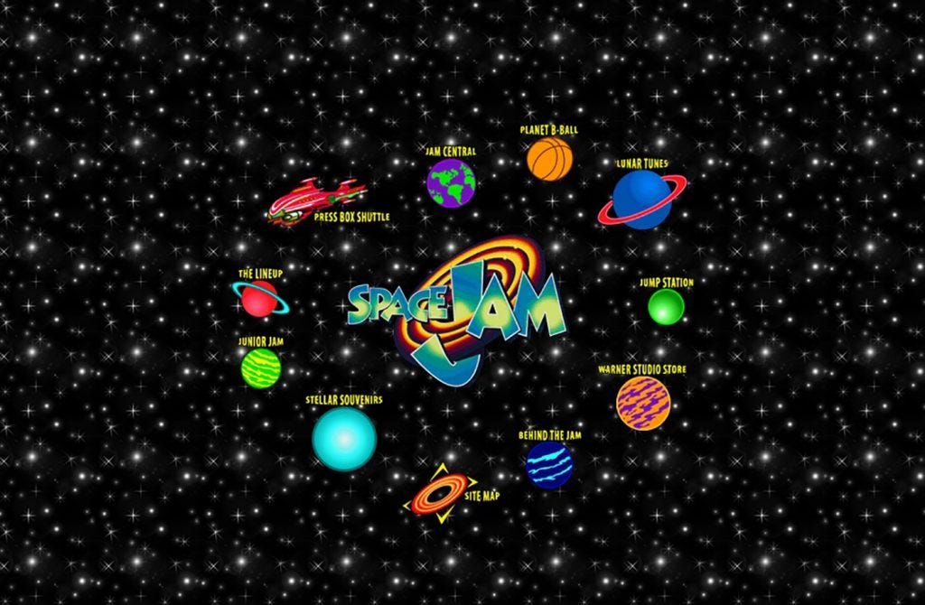
The 90s brought more data and bigger, more colorful displays. This was a fun, maximalist era for design. Design was finally getting a personality, and we got cool sites like this 1996 Space Jam site that accompanied the movie:
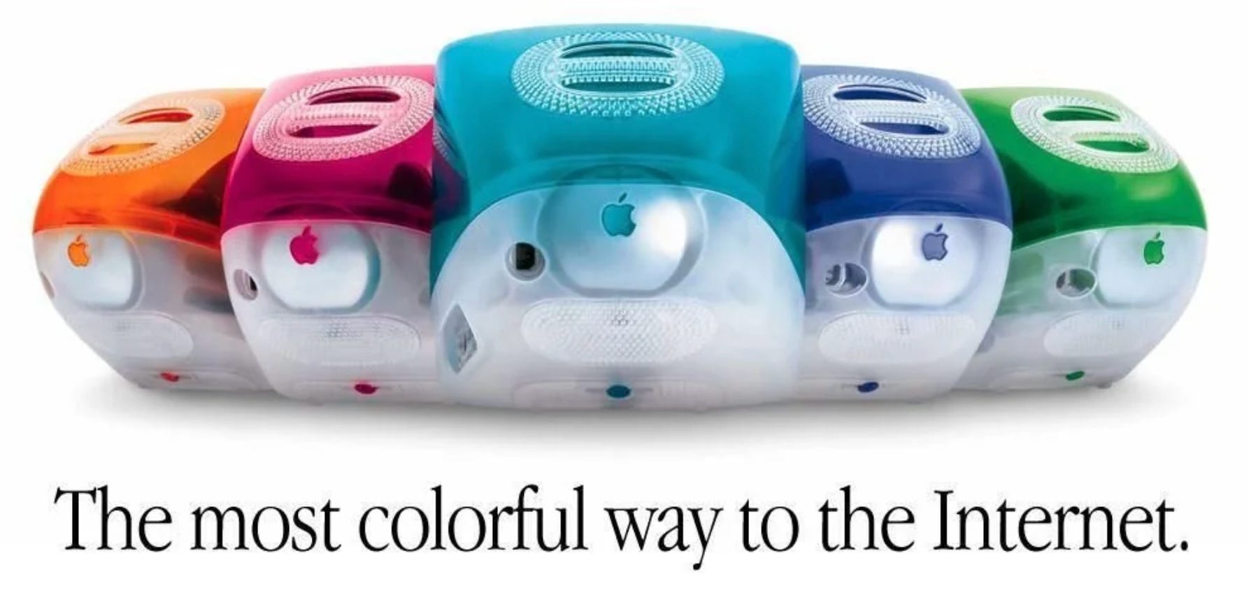
Mac OS X brought the same playfulness into the 2000s. Aqua launched in 2001 with bright, liquid-like icons that Steve Jobs famously said “look so good you’ll want to lick them.” I like that quote because it captures the glossy, polished design of the moment.
 - Wikipedia")
As web took off, everything became shiny and showy. This era reminds me of elementary school, when I thought the colorful Macs were just about the coolest thing I’d ever seen.
The iPhone then brought skeuomorphism (the idea of digital items mimicking their real-world counterparts). It’s hard to remember now, but the early versions of the Notes app were much more paper-like:

iBooks had wooden shelves, the Newsstand app (RIP) was literally a wooden newsstand, and GarageBand’s amps were photorealistic down to the knob textures. It was impressive attention to detail. I like early mobile design because, like 90s and early 00s design, it had texture and warmth and personality.
The early 2010s brought what we can call “the great flattening,” with iOS 7 stripping away textures and shadows. Google followed suit the next year. Within a year or two, every major OS had flattened its design: flat colors, lots of whitespace, sans-serif typeface. Notice how the Camera icon here goes from 3D, with shadows and a reflective lens, to a completely 2D icon:

In my mind, this flattening was the result of an app explosion (much like the AI-generated software explosion we’re seeing today): with more stuff, design asymptotes towards legibility and utility. Convention wins out.
We’ve basically been in the flat, simple era of design since iOS 7. Which is… fine? Flat design is sensible, scalable, and accessible. It works on a watch and on a TV. But it’s also boring. Design eras tend to end when underlying conditions change (cough, AI, cough) and the variables that led to flat design are finally changing. When anyone can vibe code a nice-looking app in an hour, clean and unassuming design gets the job done but doesn’t stand out. And with an AI-powered proliferation of software, standing out becomes more important, which means we need more opinionated design.
“Everyone Is a Designer” & Claude Design
Before we get to opinionated design, there’s a counter-trend worth naming: for the last decade the story has been the opposite, with design getting more democratic rather than more distinctive.
When Figma IPO’d last summer, the NYSE ran a banner that said “Design is everyone’s business.” This slogan (or some variation of it, like “Everyone is a designer”) has been a trendy saying in Silicon Valley basically since iOS 7 flattened everything. (Figma was a one-year-old company then, but still three years away from launch.)

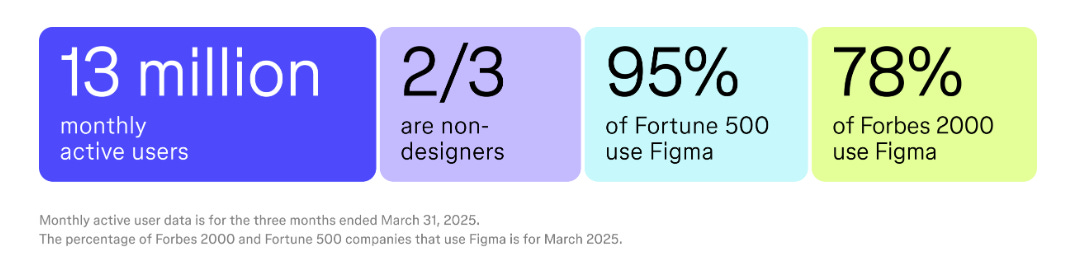
In the early years, many people underestimated Figma because market sizing analyses looked at the number of designers within companies. Fast forward to today, and two-thirds of paying Figma users are non-designers, people like developers and marketers and product managers.
Here’s a screenshot from the S-1:
While Figma has gotten more fanfare recently, with a buzzy IPO and blue-chip VC backers like Index, Sequoia, and Kleiner Perkins, Australia’s Canva is arguably the better poster child for “Everyone is a designer.” Canva has 265M monthly active users and 31M paying users, driving ~$4B in ARR (Figma crossed $1B ARR last summer) and eight straight years of profitability. Many (most?) of those users aren’t professional designers.
While the internet and software made design more accessible, AI takes things to a new level. Last week Anthropic launched Claude Design, which is powered by Opus 4.7 and lets you create, edit, and prototype visuals like websites, slide decks, and mockups. (Figma stock dropped 7.7% on the day of the launch.) With Claude Design, you can use text prompts, images, or codebases. I’ve been playing around with it and it’s been great.
Some examples:
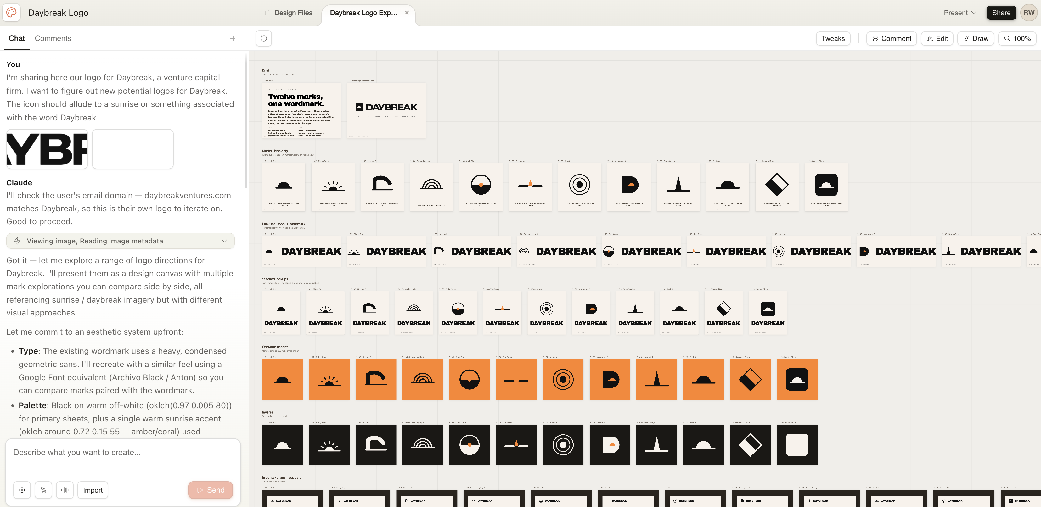
We’re looking to revamp our Daybreak logo. I uploaded our current logo to Claude and within a few seconds had 12 new icons and wordmarks. None of them were perfect, but they were good starting points for iteration.
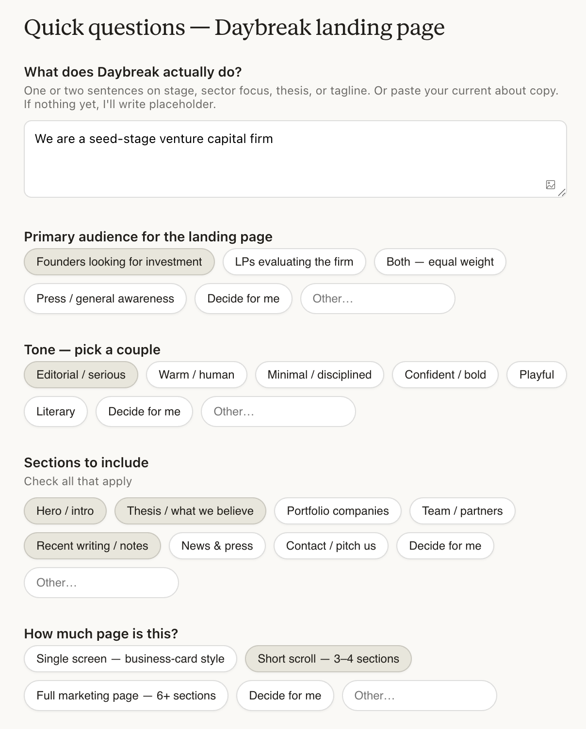
If I then ask for a full-on Daybreak website, Claude prompts me with (smart) questions:
The result isn’t anything groundbreaking (AI copy, in particular, tends to be pretty cringe and on-the-nose), but it also isn’t bad. It’s a solid start, pretty good for <60 seconds of work.
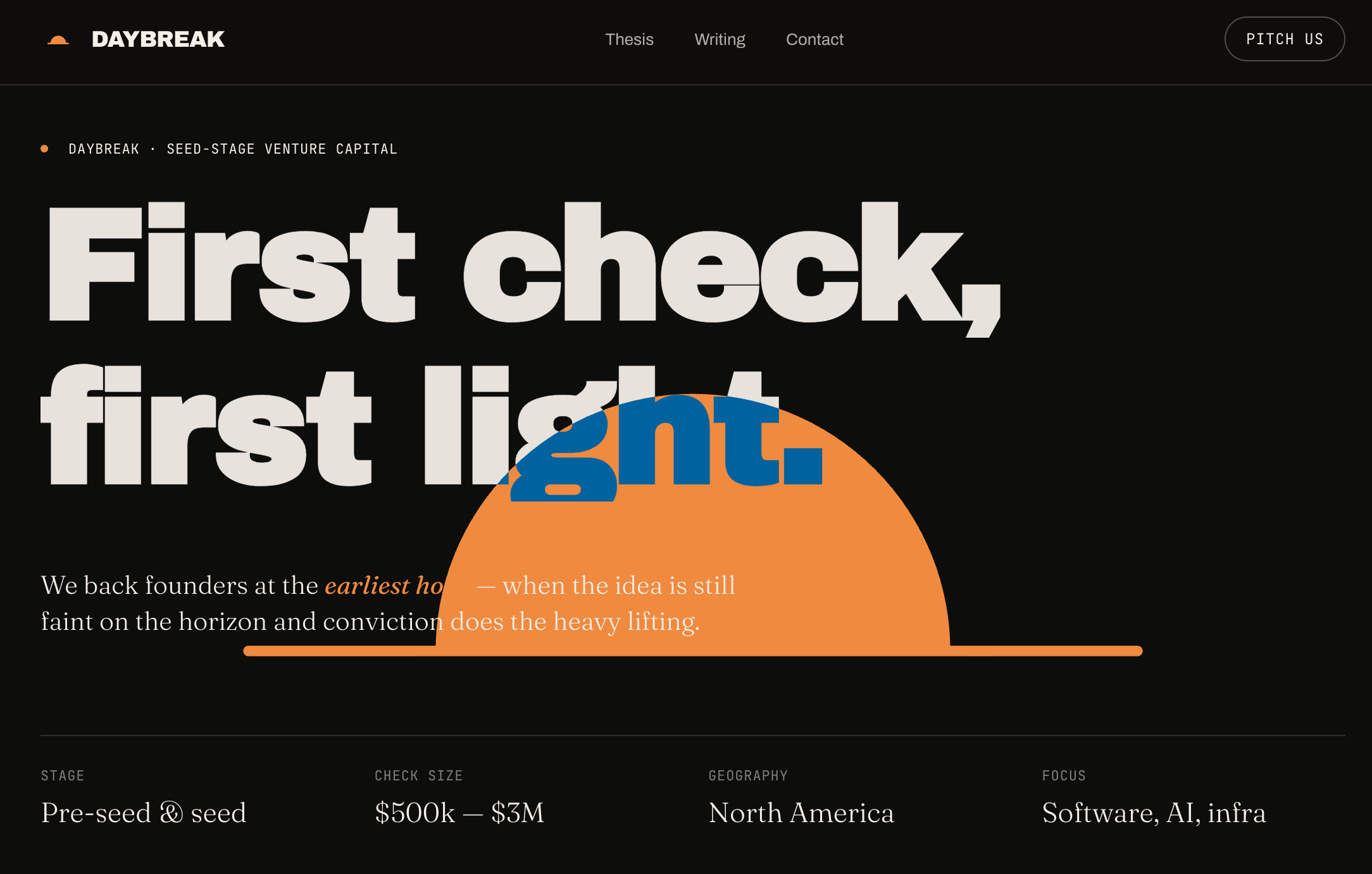
But the design looks… flat. The problem with AI design is that it’s inoffensive and unmemorable. Design has been stripped of personality over the last decade (again, in favor of legibility and practicality). But when production costs collapse, as they are now, the scarce input becomes attention. Opinionated design attracts attention and wins out.
The Design Renaissance: Good Software Is Opinionated Software
I often think about interior design as a metaphor. I love interior design because it’s really about subtly influencing how someone feels in a space. It seems simple on the surface, but it’s actually remarkably complex. (I’ve gone down many a rabbit hole; don’t get me started on visual weight.) The best tech products have a specific vibe to them, like they’re a very specific destination for a very specific audience.
Discord is very dive bar-esque, dark and noisy and chaotic and overwhelming. The product is off-putting to many people, particularly people accustomed to the more corporate Slack. Notion, meanwhile, is like a nice office: not a WeWork, but still a fairly corporate and functional space. CraigsList is your uncle’s garage that hasn’t been touched since 2004, and that’s completely the point.
All of these products are deeply opinionated products, which make them effective. You can almost visualize them—and here’s Nano Banana Pro doing just that for us:
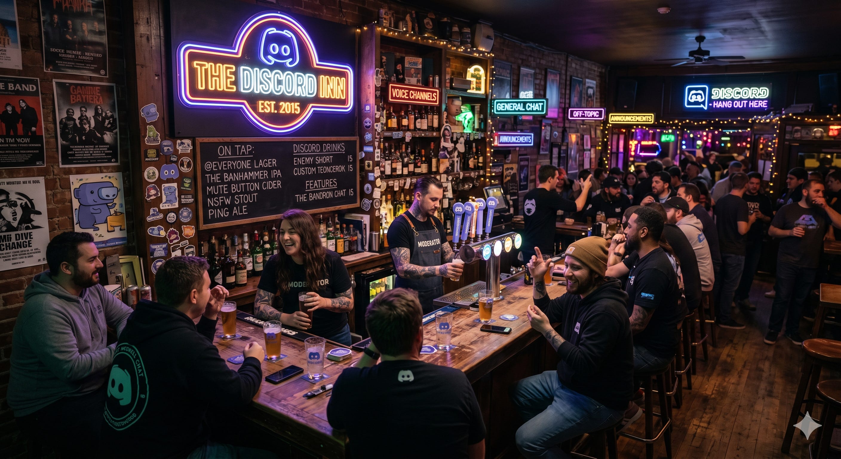
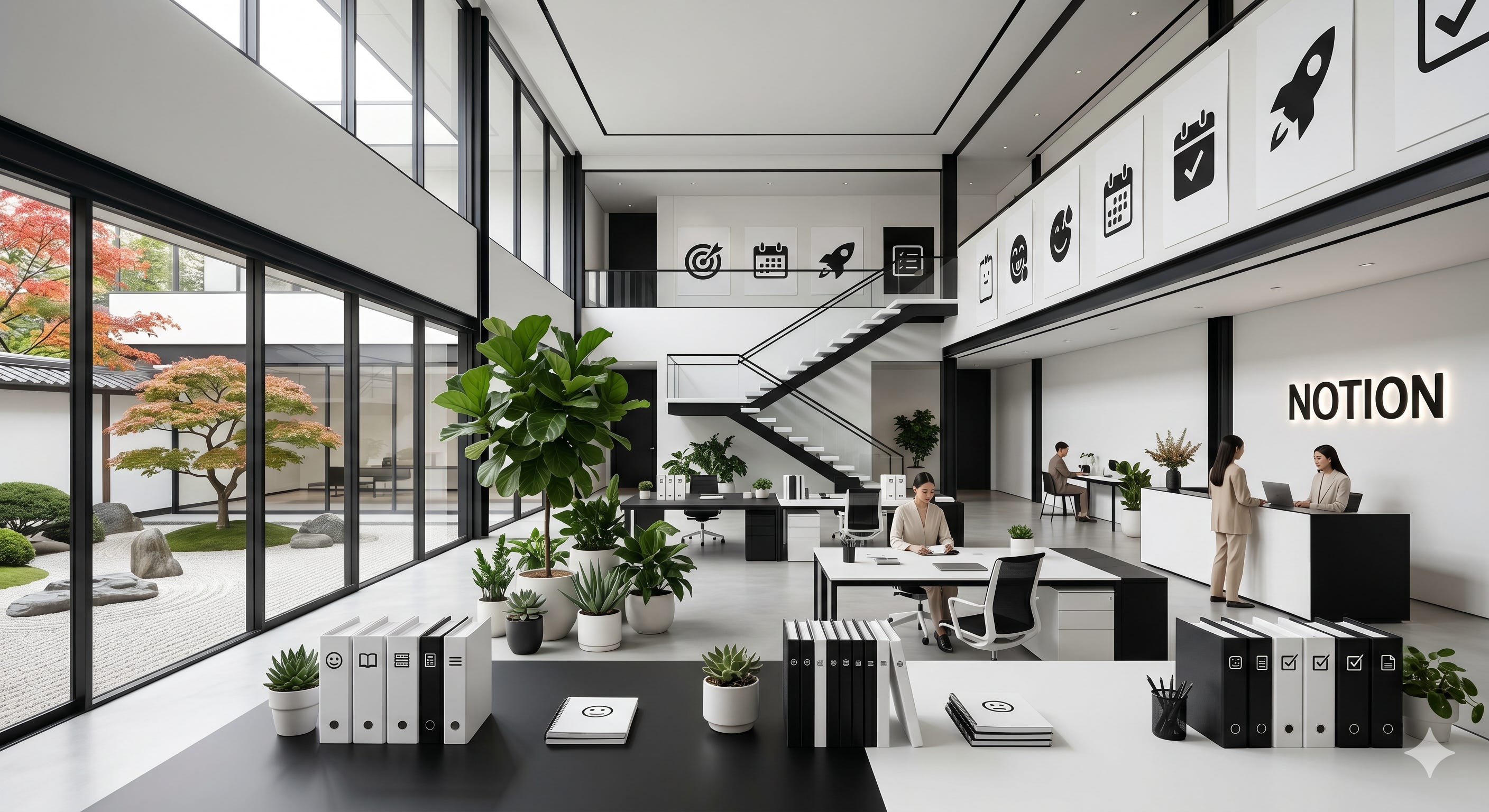
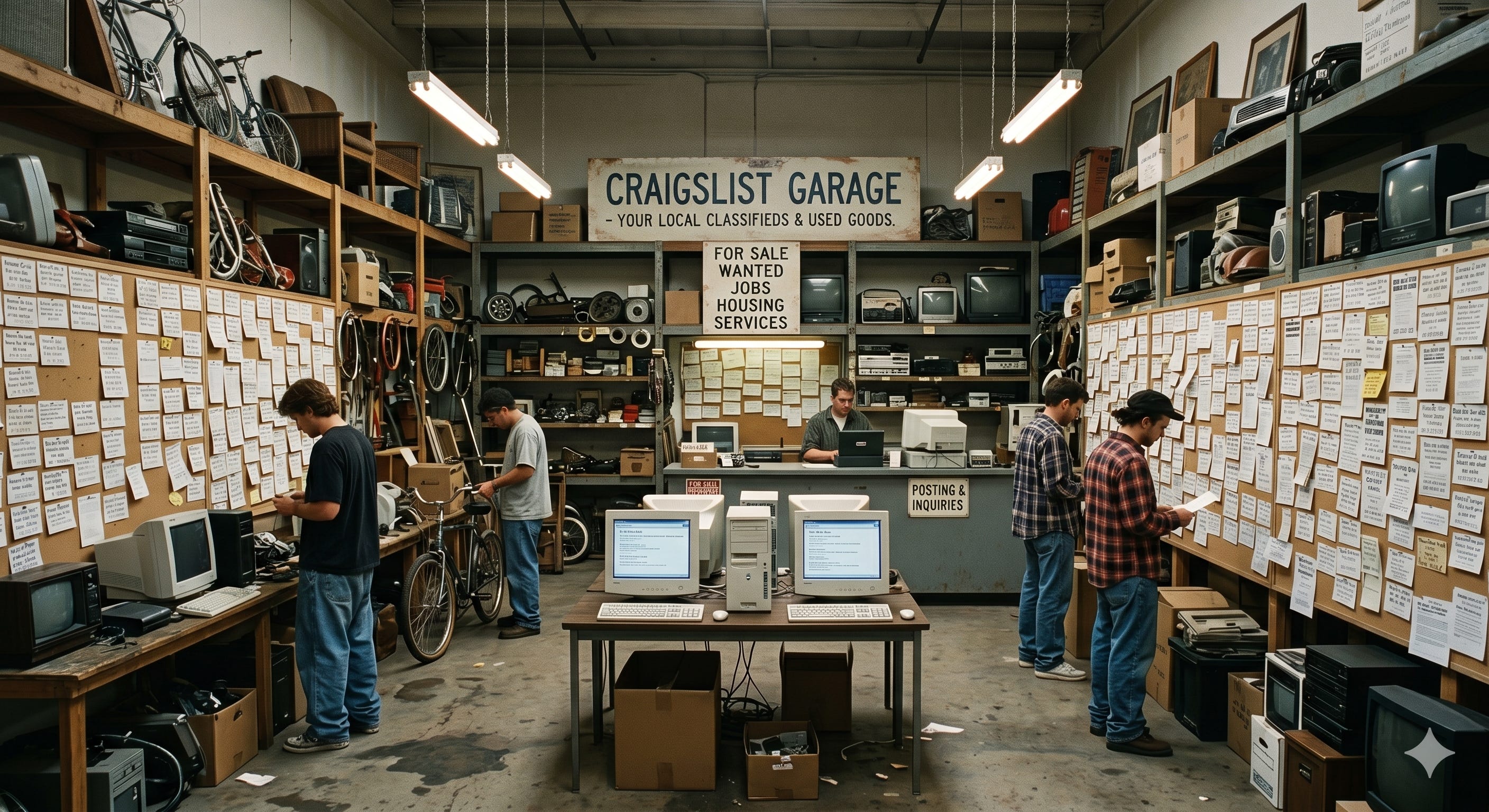
Good design evokes a space and a vibe, which we’re now seeing in AI products.
One of the reasons I like Claude is its design is more opinionated than ChatGPT’s. Claude uses a custom serif called Copernicus. A serif is unusual for a modern product UI, given that serifs read as more editorial, considered, and slow. This is one reason Anthropic feels a little like a bookshop. I found last year’s Claude Cafe pop-up in West Village impressive, because it effectively captured the digital ethos of the product in a physical space.

ChatGPT, meanwhile, feels more like an inoffensive hotel lobby, sterile and meant to appeal to the masses. ChatGPT’s body text is a geometric font (a variant of Söhne for the font nerds among us), which is basically the default typography of tech. And while Claude uses an off-white palette (creams + burnt oranges), ChatGPT uses a more clinical white. Claude is warmer, while ChatGPT is more neutral.
Anyway: the point is, I think we’re finally entering an era of more opinionated design. I’m not sure flatness is going anywhere—it has its benefits—though I hope some products experiment with more maximalist, retro aesthetics. But I do think we’ll see more care and attention put toward design, and we’ll see more big swings.
The best products are the products that feel like somewhere, while most AI-generated stuff feels more like anywhere. As software gets infinite, the premium of being in a very specific destination will go up. My read is that people are tired of minimalism and conformity, and the next era belongs to designers who know exactly what room they’re building and who’s invited in.
Thanks for reading! Subscribe here to receive Digital Native in your inbox each week: